Pages

Subscribe:

About

Labels

Wednesday, 20 November 2013

MediaTek launches MT6592 octa-core mobile platform

Hooray! MediaTek finally unveiled the new MT6592 platform, an octa-core mobile platform. Built on the advanced 28nm HPM high-performance process, it packs low-power Cortex™-A7 CPU cores, and courtesy of the Heterogeneous Multi-Processing use model on top of ARM's big.LITTLE architecture, all eight cores can operate simultaneously -- at up to between 1.7 GHz and 2 GHz, depending on the version. 


Concerning to multimedia subsystem, it integrates an ARM Mali™-450 MP graphics processor clocked at 700 MHz, an advanced video playback system supporting Ultra-HD 4Kx2K H.264 video playback and support for new video codecs such as H.265 and VP9, a 16-megapixel camera and a Full HD display.

MT6592 incorporates MediaTek's advanced multi-mode cellular modem and a full connectivity capability for dual-band 802.11n Wi-Fi, Miracast screen-sharing as well as Bluetooth, GPS and a FM tuner. The next big step for MediaTek is the entrance into LTE market, so let's see if there are any upcoming news regarding this matter.

The first devices to feature the new platform are expected to arrive as soon as end of year, so let's get ready for it!

Sunday, 21 April 2013

ZTE V987 (Dual SIM with 3G support)

Introduction

Although I was still very happy with ZTE V970, specially now that it was already running Android 4.1 (Jelly Bean), I couldn't resist to try out a new smartphone based on the freshly released platform from MediaTek...

It was only a matter of time before ZTE came out with another device that would use the same look as its much anticipated Grand S. Announced as its fat brother, ZTE V987 (also known as Grand X Quad) is a Dual SIM Dual Standby smartphone based on MT6589 chipset. Despite the fact that the newest MediaTek chipset was announced as supporting Dual Active functionality, it doesn't means that every phone would include such a feature. Probably due to development and implementation costs, this phone still does not include that feature. In fact, it is yet to be seen the first DSFA device based on MT6589 platform.

Specifications

Chipset

Name:MediaTek MT6589
CPU:Quad-core 1.2 GHz ARM Cortex™-A7
GPU:PowerVR™ SGX 544MP
Instruction set:ARMv7 (VFPv4, NEON)

Software environment

Embedded:OS: Android 4.1.2 (Jelly Bean)

Body

Dimensions
(width x height x depth):
141 x 70 x 8.9 millimetres
Weigth:165 grams (battery included)
Color:Black and white

Battery

Capacity: 2500 mAh

Memory

RAM:capacity:1 GB
ROM-capacity:4 GB
Expansion slot:microSD memory card, supporting up to 32 GB

Network support

Primary phone:GSM 850 / 900 / 1800 / 1900 MHz, UMTS 900 / 2100 MHz
Secondary phone:GSM 850 / 900 / 1800 / 1900 MHz
Data links:GPRS, EDGE, HSPA+

Display

Type:IPS-LCD capacitive touchscreen / OGS (one glass solution)
Size:5 inches, HD resolution (720 x 1280 pixels)

Camera

Main (rear):8 megapixels with autofocus and single LED flash
Secondary (front):1 megapixel

Interfaces

Bluetooth (802.15):Bluetooth 4.0 + Enhanced Data Rate + A2DP
Wireless LAN / Wi-Fi (802.11):  IEEE 802.11 b/g/n
USB:USB 2.0 Client, Hi-Speed (480 Mbit/s)
USB Series Micro-B (Micro-USB) connector

Satellite navigation

Built-in GPS module:MT6628 chipset
GPS antenna:Internal
Complementary GPS services:  A-GPS (Assisted GPS), MediaTek EPO (Extended Prediction Orbit), GLONASS

Additional features

Sensors:Gravity, Proximity and Light sensors
Analog Radio:FM radio (87.5-108 MHz) with RDS radio receiver
Others:Dedicated LED for notification of missed calls / new messages

Design and construction

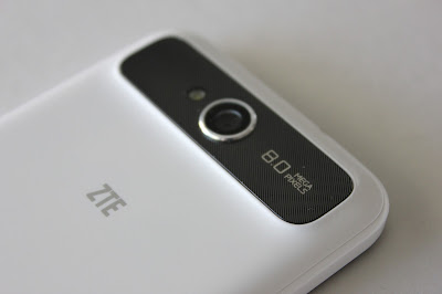
Very much resembling ZTE Grand S, this ZTE V987 features a 5 inch screen and measures 141 x 70 x 8.9 mm, being a little thicker where camera is located. The sides and back cover are made of white plastic, but in overall the build quality is very good. 

ZTE opted out to use OGS (One Glass Solution) technology to keep the smartphone relatively slim. After a week of use, I've found that most of the commonly used functions like swiping through menu, making calls, accessing music... all can indeed be done by using just one hand.


The three usual Android touch-keys are placed on the bezel  –  Back, Home and Menu. The buttons are illuminated by a backlight when the screen is turned on.


The volume rocker is placed on left edge, but not at the very top so that it can be easily reached while holding the phone with one hand. The microUSB port is located on that same edge, at the bottom.


The 3,5 mm headset jack and power button are located on the top edge.


One thing that was strangely missing on ZTE V970 was a front camera, but fortunately ZTE did not repeat the same mistake with V987. Placed right next to the ear speaker grill is the 1 megapixel front camera, which is very used nowadays for video chat purposes. On the opposite side is placed the usual power charging LED (red colored when charging and green when the battery is fully charged). The green LED also blinks to notify the user of eventual missed calls and / or new messages received.

On the back side, there's the 8 megapixels autofocus camera placed left to a single LED flash.


Placed in the lower-left corner, there is a small notch that allows you to (not too easily) peel off the rear cover, providing access to the SIM card slots, battery and microSD card slot.


The microSD card can be accessed without removing the battery, meaning that you can remove and replace memory card without turning the phone off, much like you would on a computer.

Display quality

The phone sports a 5-inch HD touchscreen display with 1280 x 720 resolution, offering a 320ppi pixel density. Text, icons, images and videos look sharp and the viewing angles are quite wide.


Under sun visibility on is very good, the screen used in this smartphone is reflective. The touch response of the screen is also good.


Functionality

The phone was released with Android 4.1.2 and hopefully will receive an update to Android 4.2.x in the near futureAside from a few custom icons and a redesigned status bar, ZTE didn't change the interface too much, so we are present with a clean Jelly Bean UI. Here are some screenshots and details of the most important features with a special detail of the dual SIM functionality.


The notification panel provides a fast access for brightness and display timeout setting, enabling or disabling auto rotation, Wi-Fi, BT, GPS and data connection, as well as alternating between sound profiles.


So, nothing much to say about the stock Android 4.1 look...


The dialer interface is pretty standard, supporting smart dialing feature which works perfectly and very fast. There is only one call button, that can either pop up a dialog allowing the user to choose which card to dial from or can dial automatically from the SIM card that is set as default.


When the active application is Phone or Messaging the user can slide down the notification panel to easily switch between the default card for establishing phone calls / sending messages.


Within the call log history, calls can be filtered by received, established or missed calls, but can also be checked which SIM was used.


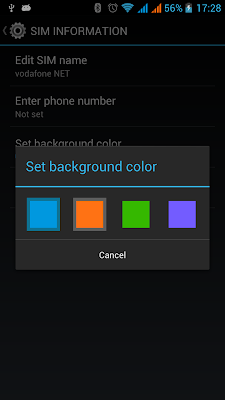
Under the dual SIM management menu several configurations can be set. The user can edit the name of each SIM and also set the associated background color that will appear in call log as well as in the notification bar (behind the network strength bars).


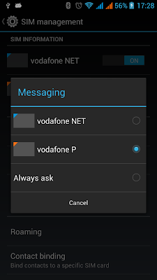
In the same menu, the user has the possibility to set a default SIM card to establish all outgoing calls or set it to always ask. The same thing can be set for messaging and data connection purposes.


Since the release of Android 4.0 we were presented with fancy controls for managing network data usage. The user can monitor total usage by network type and application and then set limits if needed. Of course, as mobile data can be enabled on SIM1 or SIM2, data usage of each SIM card can also be tracked.


It also natively supports tethering and portable hotspot feature, letting the user share mobile data connection through USB or over a wireless (Wi-Fi or even Bluetooth) network.


Just like it happened on the previous MediaTek platforms (MT6575 and MT6577), with the newest one (MT6589), SIM2 will be reachable even if there is an active data connection established on SIM1. The data connection will be immediately dropped when a new call is incoming from SIM2 and the download will be automatically resumed after the call is over.

The phone supports quad-band GSM as well as UMTS 900 MHz and 2100 MHz as confirmed under hidden MTK Engineer Mode.


The phone doesn't come pre-installed with Google apps, but that can be easily installed and all Google services work perfectly. As it can be noticed, I even got the chance to test the new version of Google Play Store.


Battery life
    Battery lifetime of this phone is impressive taking into consideration the display size. After a usage of almost two weeks, I estimate that battery can easily hold juice for three days. That is with Bluetooth turned on, 3G data connection always activated and alternating with Wi-Fi when hotspots available. Other than that, I haven't noticed any strange battery drainage. 

    GPS
      Compared to the old MT6577 based devices, there is also a great improvement when it concerns to GPS performance. V987 locks very quickly and precision is much higher, at least when comparing it to V970.


      The phone supports A-GPS and EPO (Extended Prediction Orbit), which is a MediaTek proprietary offline server based A-GPS technology. As for GLONASS, I wasn't able to connect to any satellites during the few times I used the GPS. During the next week I will test it further and update this review with additional info.


      Final thoughts

      I have to mention that this is the biggest smartphone I have ever had, but that's not really a big deal and nothing you can't get used to... and after all, it seems that the global trend is to have bigger and bigger phones. I'm really impressed with V987 performance, screen quality and battery lifetime. If you are looking for a good quad-core MT6589 phone, this is without any doubt a great choice.

      This phone can be bought from etotalk.comZTE V987 is now available for 309.99 USD.

      Highs:
      • Amazing screen quality
      • Great performance
      Lows:
      • Size (may be considered too big, but there are no good alternatives)
      • Price

      Sunday, 16 December 2012

      MediaTek officially announces MT6589

      Just a few days ago, MediaTek has officially announced the launch of the new MT6589 platform for Android smartphones. According to the company, MT6589 will be the world's first commercialized quad-core SoC (System on a Chip), available for mid to high-end Android smartphones and tablets worldwide. It integrates MediaTek's advanced multi-mode UMTS Rel. 8/HSPA+/TD-SCDMA modem, a power-efficient quad-core Cortex™-A7 CPU subsystem from ARM, PowerVR™ SGX Series 5XT GPU from Imagination Technologies, and is delivered in 28nm process technology.

      To keep up with the increasing multi-SIM demand around the world, it will support Dual SIM Dual Active functionality. This is for sure the most interesting news about MediaTek MT6589.

      The new MT6589 quad-core solution supports 1080p 30fps/30fps low-power video playback and recording, a 13MP camera with integrated ISP, up to FHD (1920x1080) LCD displays, and enhanced picture processing for DTV-grade image quality.


      It will also support Miracast™ technology for multi-screen content sharing and pre-integrate MediaTek's leading 4-in-1 connectivity combo MT6628, which supports 802.11n Wi-Fi, BT4.0, GPS and FM.

      MediaTek MT6589 is currently being incorporated into smart devices by MediaTek's leading global customers, and the first models based on this new chipset are expected to ship commercially in the first quarter of 2013. Stay tuned because this upcoming SoC is very promising!

      Tuesday, 27 November 2012

      What's new about Android 4.2

      Over the course of the past day, we have seen Google start to rollout an Android update, first to Nexus 10 devices, then to Nexus 4 devices, and most recently to Nexus 7 devices. The OTA update to version 4.2.1 is probably still in the process of propagating to all device owners.
      The update is small, but packs an important fix in correcting the missing month of December. According to sources, the update also includes support for HID gamepad/joystick devices and some improvements to handling of vibration notifications. Here's a tour of the most noteworthy changes.
      Android 4.2: A sweeter Jelly Bean

      Multiuser support

      Perhaps the most groundbreaking change in Android 4.2 is support for multiple users on tablets. The latest Android OS allows you to set up numerous accounts on your device and switch from one to another with a couple of quick taps.
      The feature makes it easy to share a device with family or friends: Each user has her own home screen, apps, wallpaper and general settings. What's more, every user's data -- photos, files and so forth -- remains inaccessible to other users.
      (Of course, some basic system settings, such as Wi-Fi configuration, are universal and shared among all users).

      New 10-in. tablet UI

      With Android 4.2, the 10-in. tablet takes on a whole new look that more closely resembles the Android phone UI, with a status bar and notifications pulldown at the top of the screen and a Favorites Tray with access to the app drawer at the bottom.
      Google's goal with the change is to create a more consistent user experience across device forms. Moving from a phone or 7-in. device to a 10-in. tablet now feels seamless and natural, with practically no learning curve required.

      Quick settings

      While third-party widgets have long let you add "quick settings" panels into Android, Google makes that functionality a native part of the system with its latest OS. Android 4.2's integrated quick settings panel gives you easy access to basic system settings such as Wi-Fi, Bluetooth, battery status and screen brightness.
      On phones, the panel is accessible via a link in the main notifications pulldown; you can also jump to it directly by swiping downward on your screen with two fingers instead of one.
      On tablets, meanwhile, the main notifications panel is on the left side of the screen, while the new quick settings panel lives in a separate pulldown on the right.

      Photo Sphere

      One of the most interesting new elements in Android 4.2 is something Google calls Photo Sphere, which builds upon the panoramic photo function introduced with Android 4.0 and turns things up to 360 degrees -- literally.
      Photo Sphere uses the same technology as Google Street View to let you capture interactive 360-degree images and share them with friends. Just follow the system's prompts to snap images around you and then watch as it melds the photos together into one giant sphere.
      Due to their interactive nature, Photo Spheres can be viewed only within Google Street View or Google+ (or on an Android device). Check out some of Google's sample Photo Spheres to get a better idea of what it's all about.

      New Camera app

      Photo Sphere aside, Android's Camera app gets a minimalist makeover in the 4.2 release. The new Camera UI revolves around a ring that appears around your finger anywhere you touch; it contains all the commands you need, including options to change the photo mode, switch between the front and rear camera, and adjust the camera's flash, exposure and white balance.
      You can also swipe your finger toward the left on the screen to jump directly to the Gallery and view your most recently captured images. With a couple more taps, you can edit any image right then and there -- using a series of filters and built-in tools -- and share it to any service you want.

      On-board security

      Worried about security? Google's got your back: Android 4.2 includes a new multilayered security system that scans apps loaded onto your phone in real time. If you opt into the service, the system looks for malicious or potentially harmful code every time a new program shows up; it alerts you if there's any cause for concern.
      (The new feature focuses on apps obtained from third-party sources; apps downloaded from the Google Play Store have beenautomatically scanned and evaluated on the server side for some time.)
      The beefed-up security setup also watches for suspicious texting activity from installed applications; if one of your apps tries to send a text that'll cost you money, the system warns you before the message is allowed to go through.

      Lock screen widgets

      Ever wish you could have widgets on your lock screen? Android 4.2 makes it possible. The release adds support for lock screen widgets -- live functioning programs that run right on your device's lock screen.
      By default, Android 4.2 gives you five lock screen widget options: Calendar, Digital Clock, Gmail, Messaging and Sound Search. The widgets live on multiple panels within the lock screen, much like what you see on the home screen.
      The Android 4.2 lock screen also provides one-touch access to the Camera app as well as the Google Now intelligent assistant. Third-party app developers can create lock screen widgets of their own, too, so many more options should be showing up before long.

      Native gesture-typing

      With Android, you're never stuck using the system keyboard (there's no shortage of excellent third-party options available), but as of the 4.2 release, you may not even feel the need to stray from the stock typing experience.
      Android 4.2 introduces a new and improved virtual keyboard that offers native gesture-typing, where you input text by sliding your finger from one key to another without ever lifting it. It's very much like what you get in Swype, a popular third-party Android keyboard application.
      Of course, you can still type the normal way, too -- and if you aren't thrilled with the new keyboard, you can still turn to alternatives like Swype, SwiftKey or TouchPal.

      Gmail improvements

      Android 4.2 brings about some small but meaningful improvements to the Gmail app. Some of the added touches are long overdue, like the ability to have a message automatically formatted to fit the width of your screen and the option to pinch to zoom in and out of email text.
      Other Gmail changes make the app just a little more user-friendly. You can now, for example, swipe any message left or right to dismiss it and archive it directly from your inbox; you can also easily archive messages while viewing them within a specific label.

      Daydream screensavers

      Screensavers hardly seem like an exciting addition, but for anyone who docks his phone or leaves it plugged in and charging during the day, Android 4.2's new Daydream feature may be just what the doctor ordered.
      Daydream lets you say "so long" to the boring blank screen and instead pick from a variety of screensavers to gaze upon while your phone is docked, charging, or both. Built-in options include a floating clock, flowing colors, rotating news headlines and a couple of different photo-based screensavers.
      Third-party developers will be able to offer their own Daydream designs, too, so we'll likely see more options soon.

      Miracast

      Android 4.2 enables support for the Miracast wireless display-sharing protocol, which lets you wirelessly stream audio and video from your Android device to any compatible HDTV.
      Right now, the practical uses for Miracast are limited: First, the feature is hardware-dependent, and the Nexus 4 is currently the only device that has it enabled. Beyond that, there aren't many Miracast TV adapters available yet, and they tend to be pre-standard compliant and not compatible with current hardware.
      Google expects to see more adapters, along with Miracast-enabled TVs, on sale throughout the coming year -- and then maybe we'll see something show up under Available Devices.